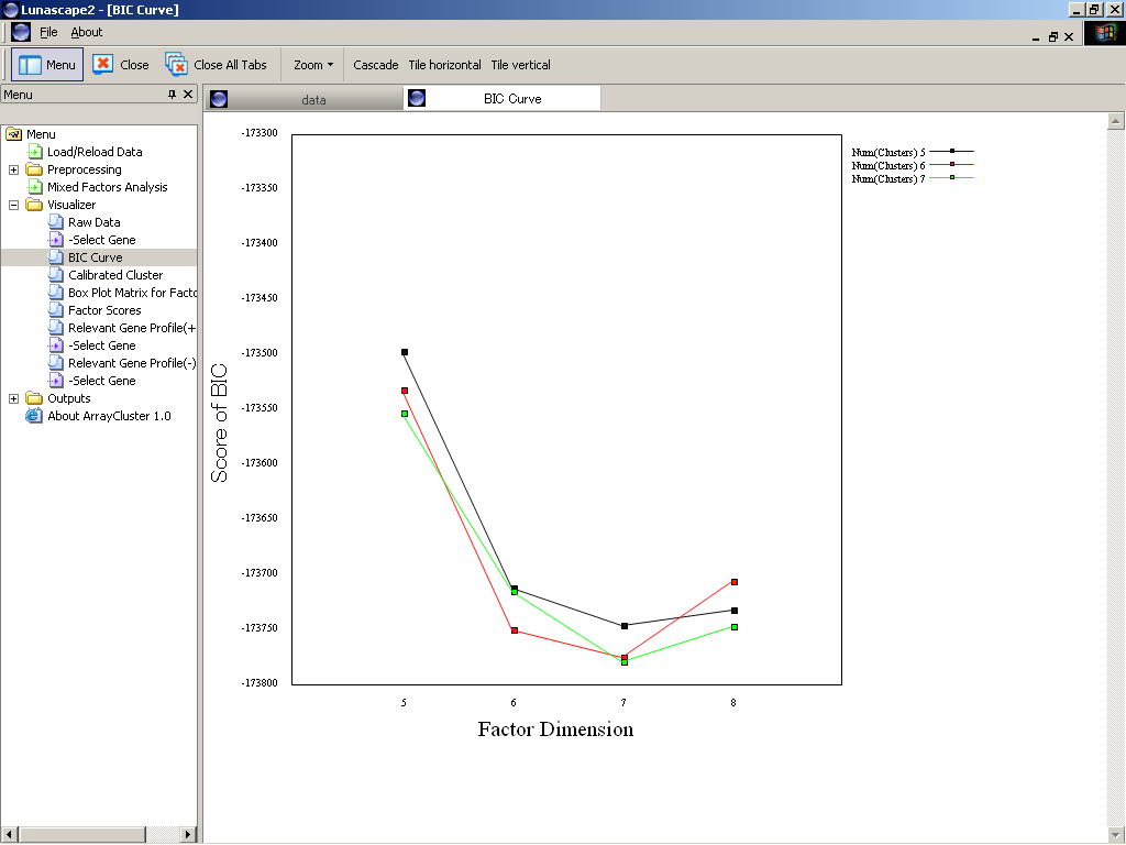
Visualizer
After running Mixed_Factors_Analysis.exe, clicking "BIC Curve"
in "Visualizer", the computed BIC scores can be viewed on the
browser as shown in Figure 1.
In this plot, the horizontal and vertical axes correspond to the factor
dimension and the BIC scores, respectively. The each line represents curve
of BIC scores against to varying factor dimensions (q) for a fixed number
of clusters (G).
Figure 1 displays three BIC curves corresponding to the number of clusters
equal to G=4, 5 and 6. A combination G=5 and q=7 attains at the minimum
of BIC, selected as an optimal.
Output File
The calculated BIC scores can be also viewed through tab-delimited text,
model_selection.txt, created at
- \C:ArrayCluster\extents\lunamacplugin\data\
File format are as like that shown in below.
Each column represents scores of a variety of G for a factor dimension
(q). In this example, those of q=6 to 8 and G=4 to 6 are shown, and the
minimum score is attained at q=7 and G=5.
File Format of model_selection.txt
- CLS|FAC 6 7 8
4 -173696.61462 -173735.18400 -173625.17138
5 -173703.26412 -173766.50205 -173701.02059
6 -173647.25727 -173703.61250 -173676.58506
Figure 1: Image of model selection based on BIC curve